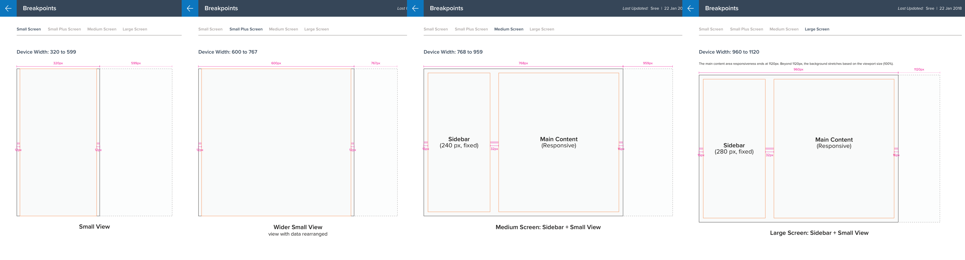
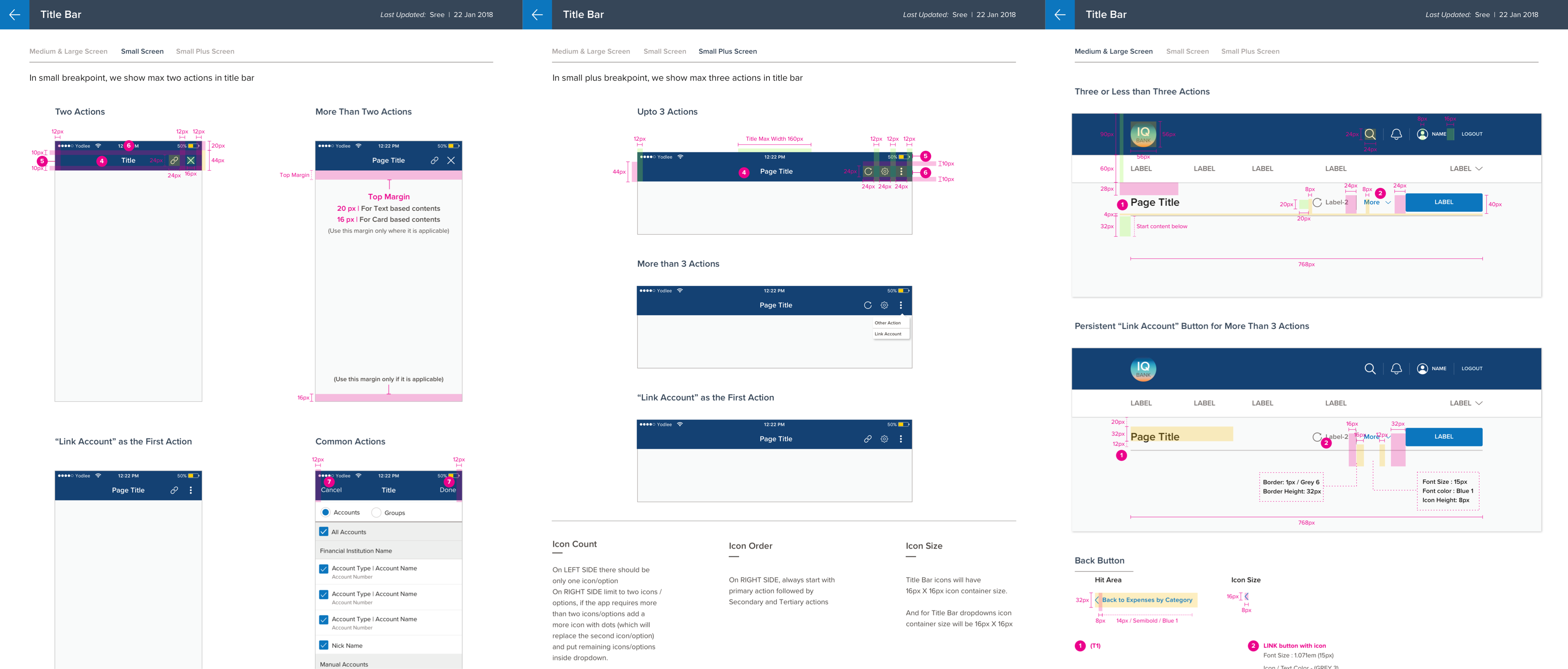
Responsive Breakpoints System
Defined breakpoints and layout patterns used across the Money app.
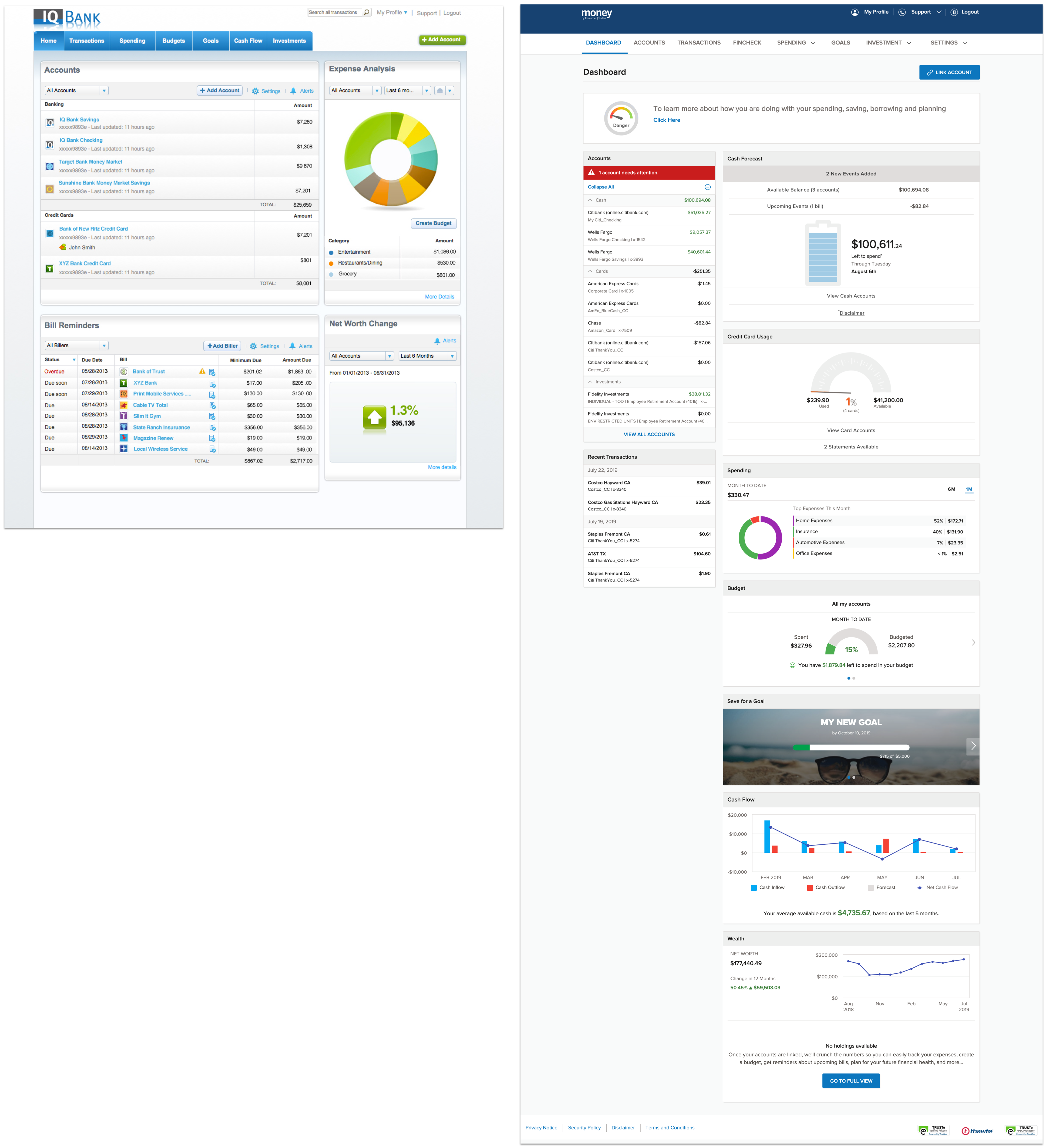
Before & After Comparisons
Side-by-side comparisons showing legacy vs new responsive screens.


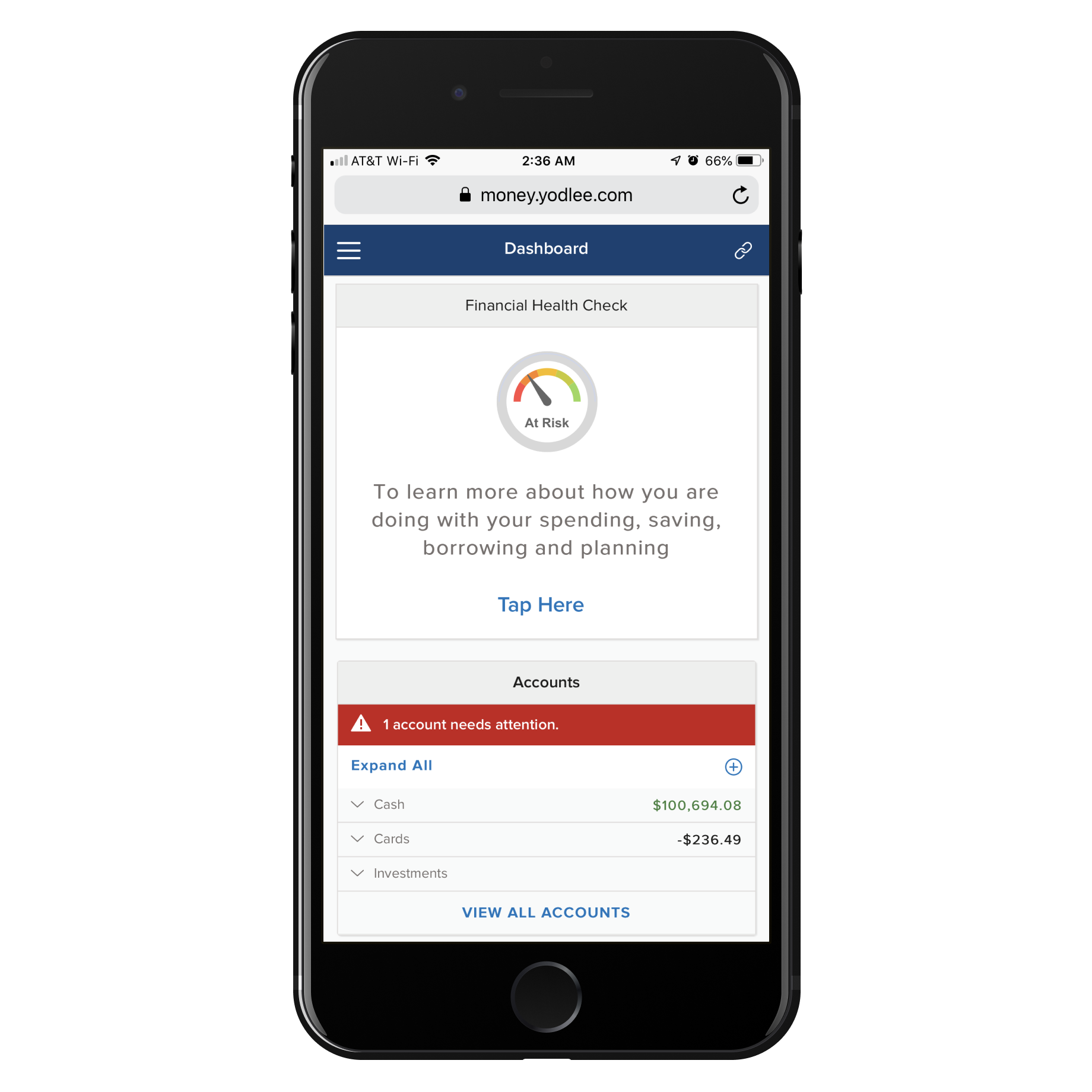
Landing & Mobile Samples
Landing and mobile-first samples demonstrating the adaptive patterns.

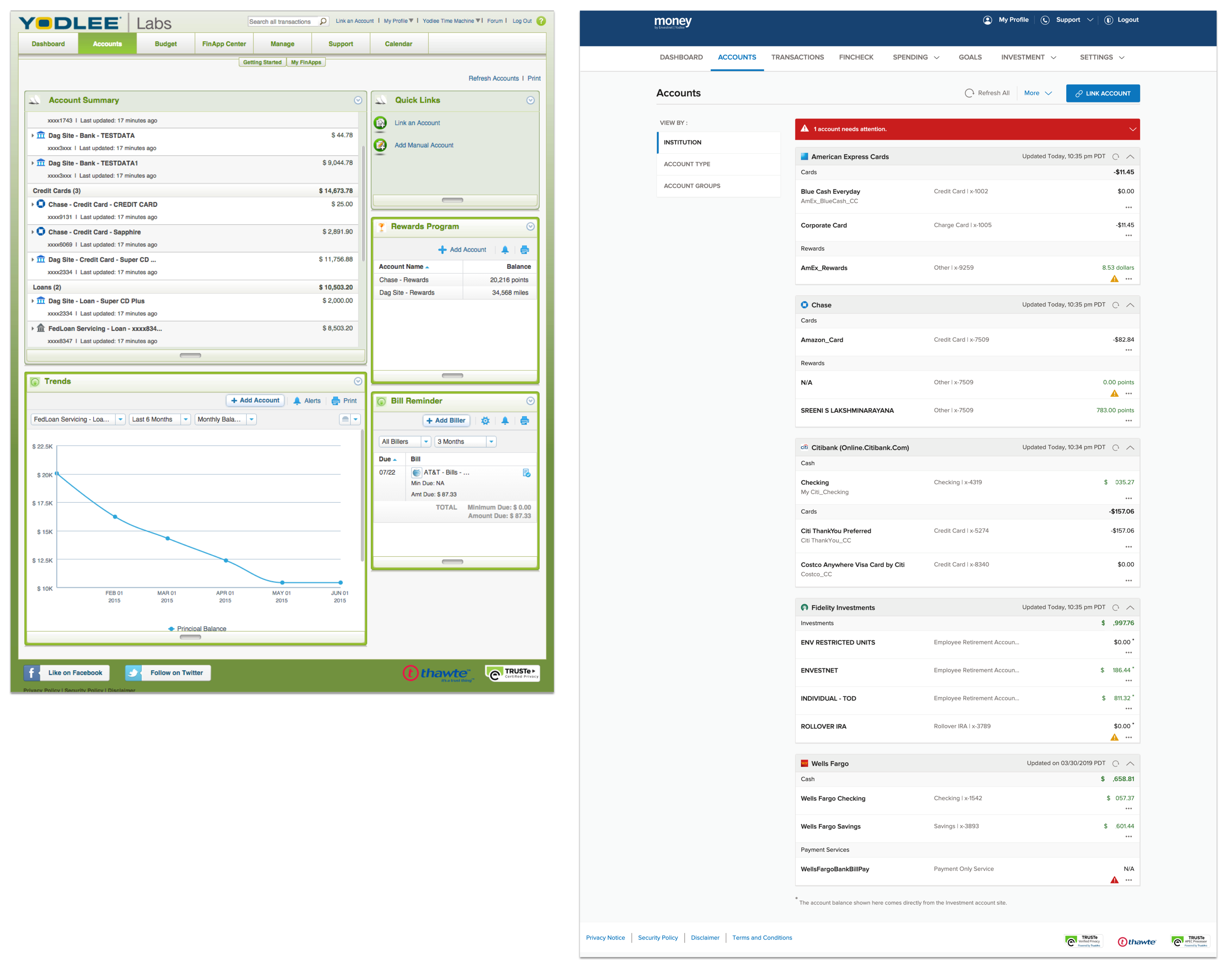
Before & After
Challenge: Legacy desktop-only dashboard that felt cramped and inconsistent when stretched to larger viewports.
Solution: Reworked the dashboard into a responsive grid that preserves hierarchy and reflows cards sensibly across breakpoints.
Challenge: Account summary and transaction screens had different visual languages across breakpoints.
Solution: Unified the data-visualization language and introduced modular components that adapt responsively.
Process
Defined breakpoint strategy and responsive grid system.
Created adaptive layouts for key screens (dashboard, accounts, transactions).
Documented specs and handed off to engineering with detailed annotations.
The Solution
Impact & Results
Seamless responsive experience across mobile, tablet, and desktop.
Reduced engineering questions through detailed specs and annotations.
Improved accessibility and usability across all devices.