Discovery
User Feedback
Analytics Insights
Users were unable to track their personal finances easily and lost context as the arrangement of cards wasn't meaningful.
Business Goal
Create a contemporary and comprehensive dashboard that offers quick & easy financial health assessment.
Design Framework
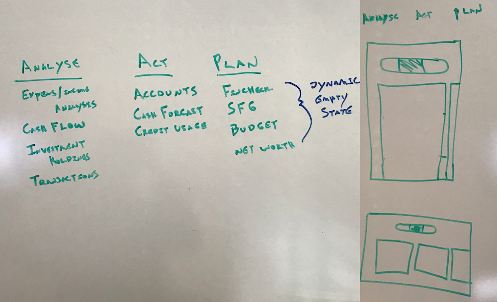
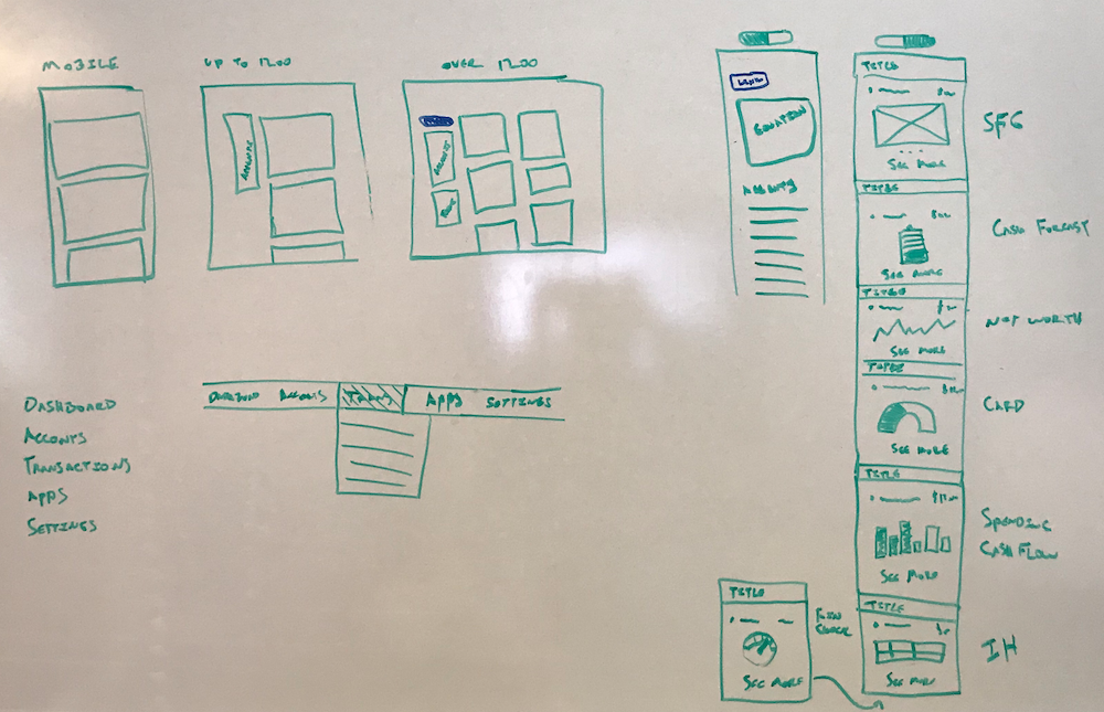
We white-boarded and made 3 contextual sections: Analyze, Act & Plan. Listed relevant FinApps under these sections, which would help users easily find what they are looking for.
Key Design Decisions
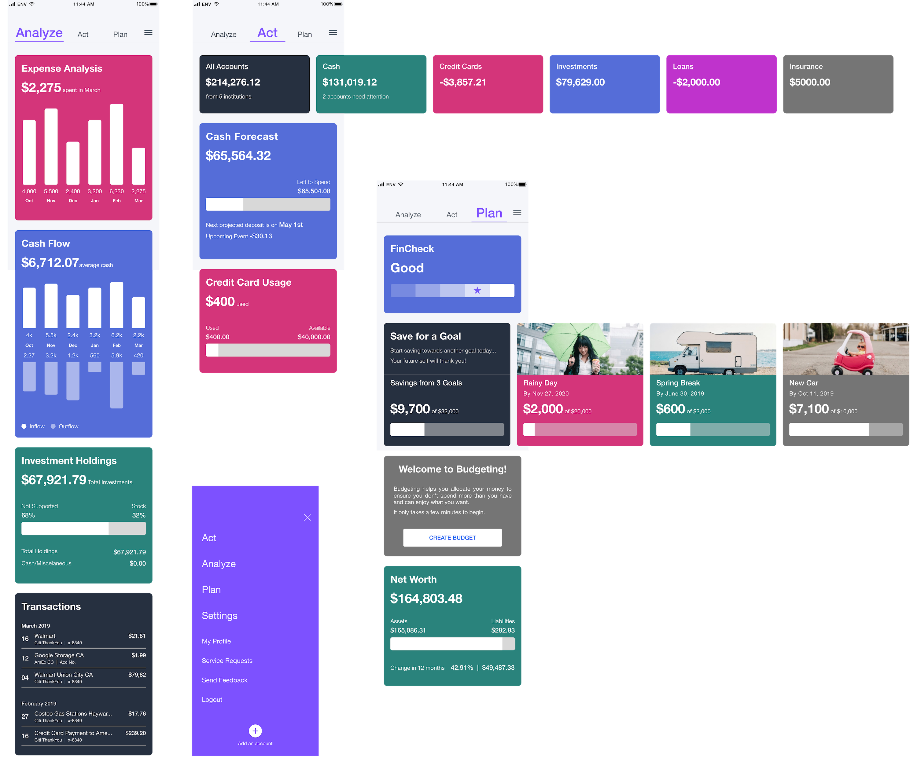
Three Contextual Sections
Created Analyze, Act & Plan framework to organize FinApps around user mental models—helping users easily find what they're looking for.
Uniform Data Representation
Established clean, uncluttered visual system with consistent typography (Helvetica Neue), bright pleasing color palette to differentiate FinApps, and standardized data visualization.
Smart Scrolling Interaction
Main cards scroll vertically while sub-category cards scroll horizontally—providing users a quick, easy overview of their personal finances without losing context.
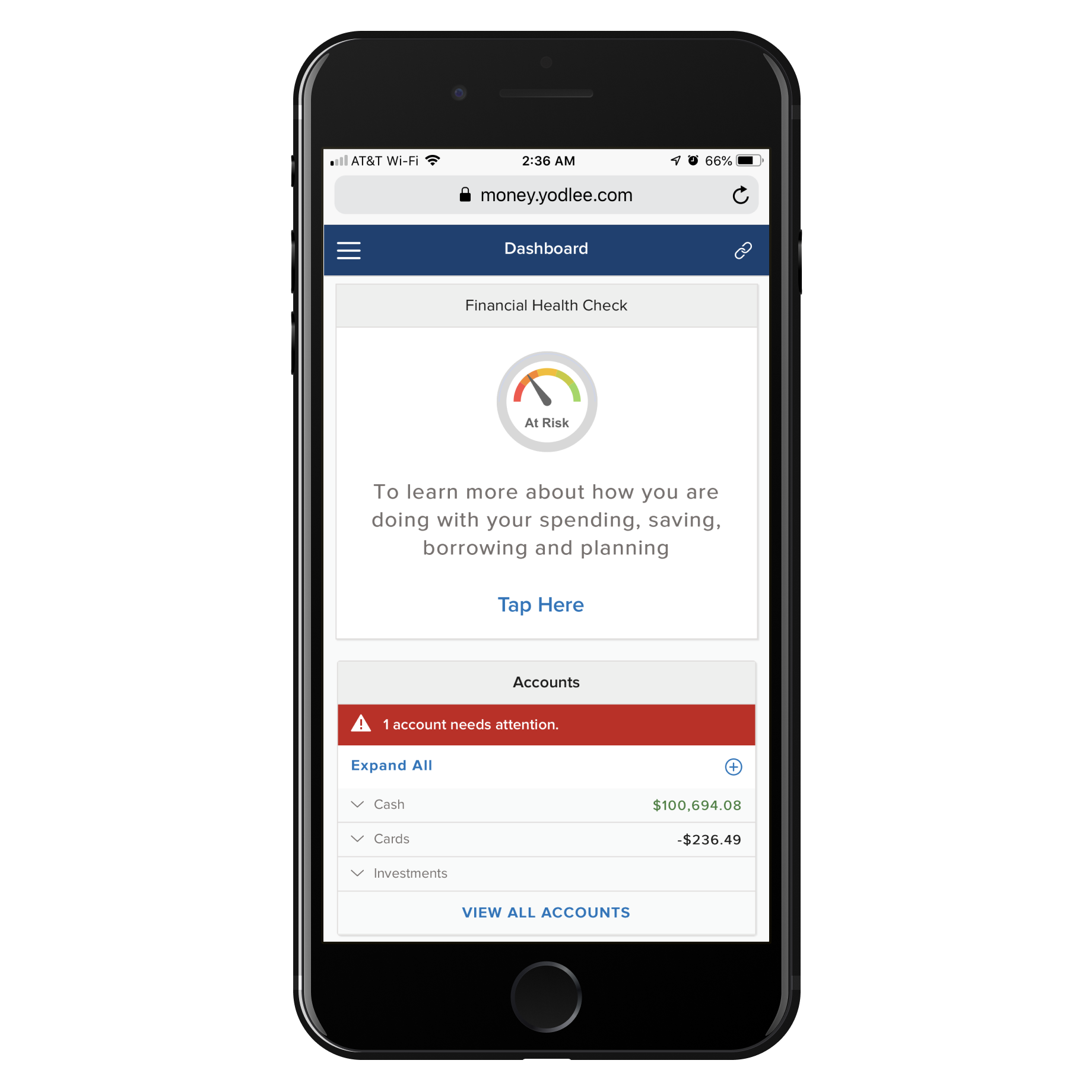
Before: The Original Long-Scroll Dashboard
The old experience showed all FinApp cards in a single long scroll, causing users to lose context and feel overwhelmed.

Whiteboarding & Early Concepts
Collaborative whiteboarding sessions where we explored the Analyze / Act / Plan framework and mapped FinApps to each section.
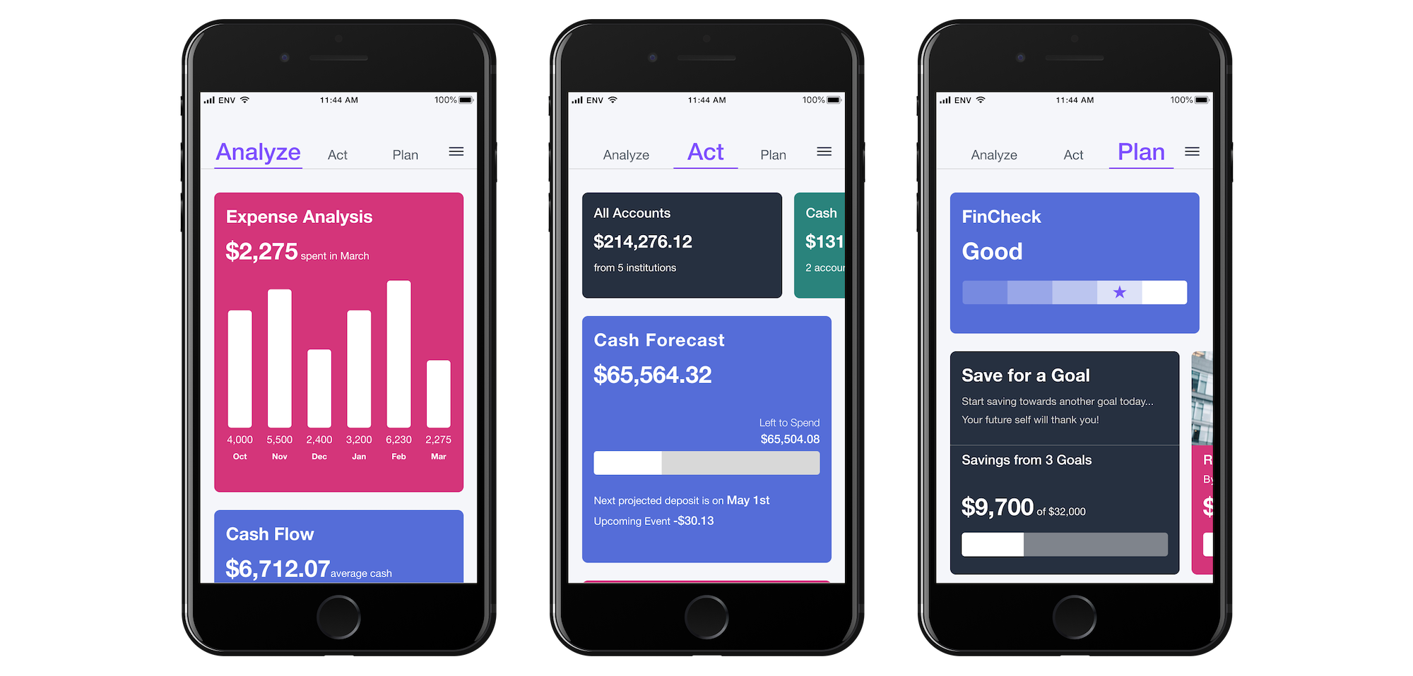
After: The Three-Section Framework
Redesigned with Analyze, Act & Plan sections—each with focused, contextual cards using uniform data visualization.
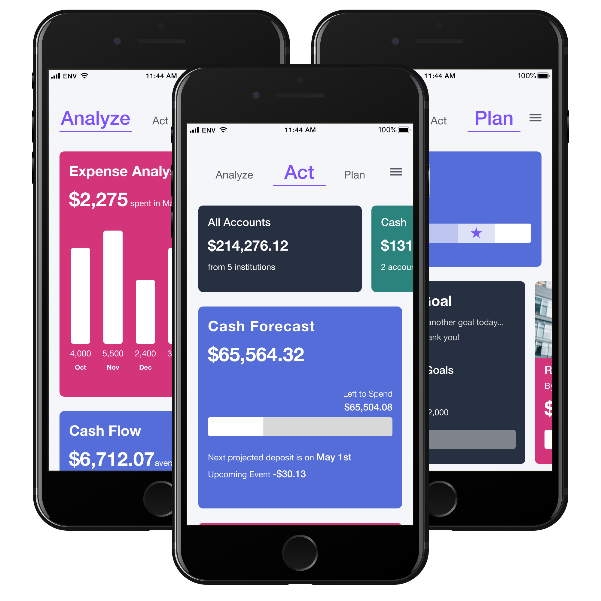
Final Design: Three-Tab Navigation
The approved design showing all three sections with consistent visual language, smart scrolling, and contemporary aesthetics.
The Solution
Impact & Results
The new simplified experience is clean and uncluttered owing to uniform data representation.
Uniform, bold & consistent typography (Helvetica Neue) with contemporary look.
Bright, pleasing color palette differentiates the FinApps effectively.
Smart interaction: main cards scroll vertically, sub-category cards scroll horizontally—providing quick, easy overview.
Management immediately approved the design when presented.
Mobile prototype created and made available for viewing.
Reflection & Next Steps
The project validated the power of framework-driven design. By organizing FinApps into Analyze / Act / Plan sections, we created structure that felt intuitive to users. Currently working on bringing the same design language to underlying FinApp screens for all breakpoints, which will further unify the experience.