User Experience / Product Designer
FinApps Dashboard
Objective
Our main product's landing screen is a long list of FinApp cards providing actionable insights on a user's financial health.
The user-testing feedback was that the users were:
- unable to track their personal finances easily
- lost the context of what they last viewed as arrangement of cards isn't meaningful.
In 2019, the leadership wanted a design offering a quick & easy financial health assessment. I was tasked to redesign the FinApps Dashboard to be contemporary and comprehensive.

Challenge
The problem statements were listed as:
- Every FinApp card existed on a single page leading to a long scroll. Users lost context of the previous ones.
- Each card had its own data visualization, users were confused.
- The data representation were arbitrary; making the UI unpleasing.
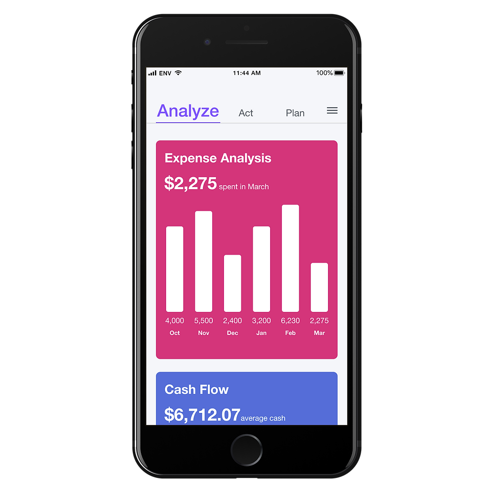
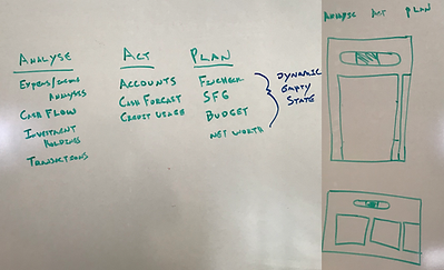
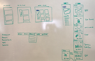
Design
We white-boarded and made 3 contextual sections; Analyze, Act & Plan. And listed relevant FinApps under these, which'd help the users easily find what they are looking for.
Result
The new simplified experience now is clean and uncluttered owing to a uniform data representation.
Typography - I used a uniform, bold & consistent typography (Helvetica Neue) with contemporary look.
Colors - Defined a bright, pleasing color palette to differentiates the FinApps.
Interaction - The main cards have vertical scroll, while the sub-category cards scroll horizontally; providing the users a quick, easy overview of their personal finances.
When presented, the management immediately approved the design.
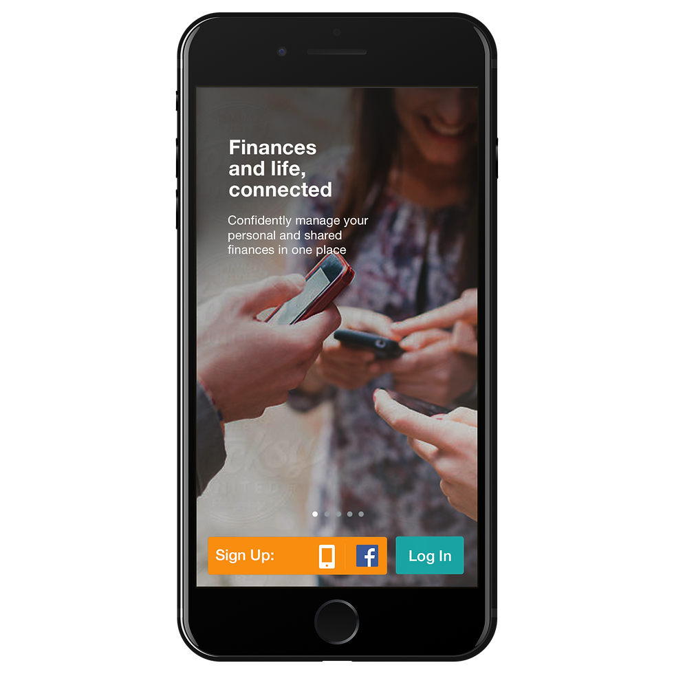
The mobile prototype of the dashboard is available for viewing:

Future
I'm currently working on bringing the same design language for underlying FinApp screens, for all breakpoints.